Personal Infotainment
Designing the infotainment experience for a next-generation commuter transportation system

The case-study below showcases a one-week independent project: a design exercise, part of the interview process for a large tech company / FAANG.
The brief was based on a fictional brand - HyperCommute - a next-generation transportation system with focus on high-speed, luxury commuter railways.
Challenge: to design a personal infotainment experience, which passengers can control from their mobile device, supporting the ability to adjust cabin experience, request service items, and stay informed about their journey.
Solution: a cohesive experience across devices, centered around user’s data and personal content. The product responds to the user needs uncovered during research, allowing for a great level of personalization, and remaining focused and simple.
____________________________________________________________
Year: 2020
My role / activities: user research; user journey mapping, concept development, UX and visual UI design.

Immersion & Discovery
Prior to research I took note of all my questions regarding the problem, the users, and scope. (i.e. “How can I design for the largest possible number of users”; “What do users want and need during their commute”; “What are the different touchpoints in a commuter’s journey”; “How will a future context influence passengers’ behavior, transportation and mobility”; and “How should I define luxury”?).
I also noted my assumptions, to establish focus moving forward: I defined the “future context” as 5 years from now, in New York City; and assumed this transportation system and Google would team up (benefiting from the integration with its ecosystem of services and data).
I created a short survey sent out to 8 commuters, with the goal of understanding their pain points, behaviors, needs and motivations.
In parallel - while waiting on their answers - I conducted a brief desk research to look for references within the broader landscape (i.e. in-car or train infotainment systems, IFE, “Future of Auto mobility” concepts, private bus services and ride sharing), for context scanning.

Research Findings & Insights
Research sample: 8 participants, young professionals, in 5 cities across 3 continents.
The survey consisted of a mix of open-ended questions & multiple choice.
Pain points: In terms of their current experience / daily commute, the main pain points were delays, time to destination, packed trains, and lack of comfort. For long-distance travel experiences (the closest comparison to the reality of this “future context”), the main pain points were unreliable trains, expensive tickets, wasted time, and poor train network.
What participants value: personal space, a quiet environment, taking more of a passive role (not having to drive), and alone time.
Unmet needs: during their daily commute, participants seek reliability, information accuracy, comfort, and a sense of control. When asked for a hypothetical “high-speed, luxurious system” participants mentioned they’d need: an affordable service, convenience, personal space, and ability to enjoy free time.
Essential information: for all participants, ETA, status updates and exact waiting times are crucial when commuting. The number one priority is getting from A to B.
Activities inside the train: in a hypothetical “high-speed, luxurious transportation” context, participants enumerated productivity, entertainment, and rejuvenation, as their activities of choice. These activities are dependent on: duration of trip, destination and participant’s mood at a given time of day.

Opportunity Framing
Based on the research I defined four opportunity areas, considering the experience on and off the train - and everything that supports commuting - to guide ideation and concept. These could potentially be refined into experience attributes.


Concept Development
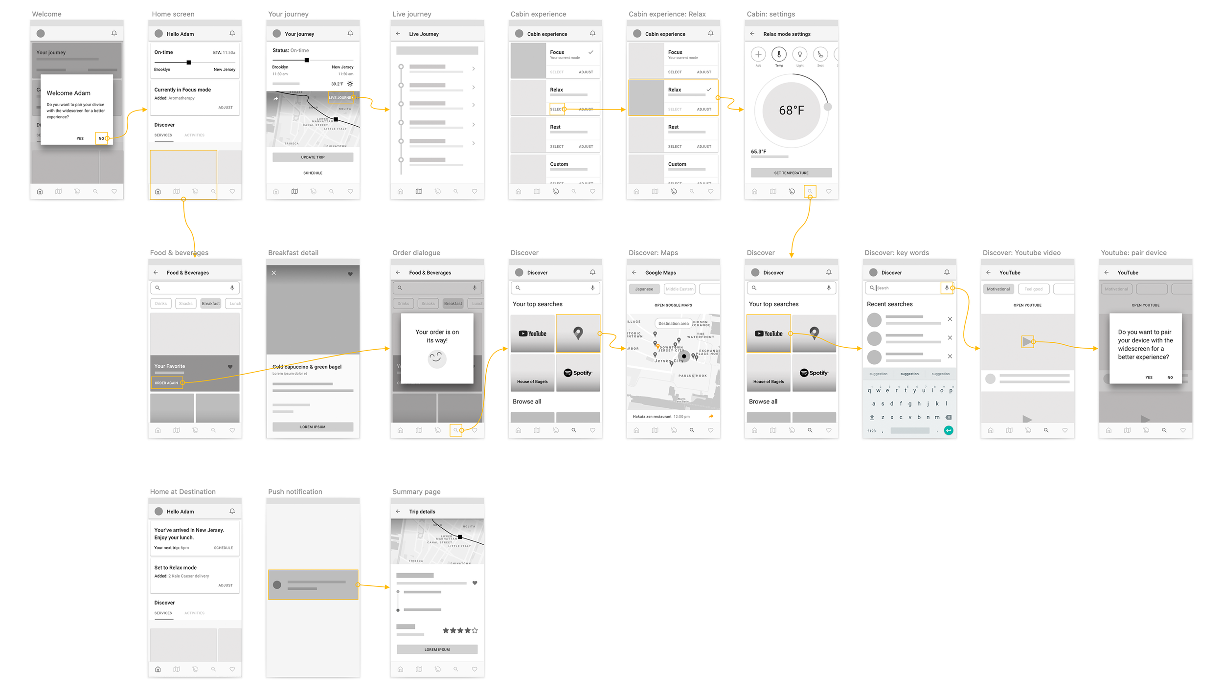
My concept entailed different actors within a connected system, but my focus was on the in-vehicle mobile experience for a specific persona and needs. After deriving user stories from the high-level journey, I started sketching these moments; thinking about the product’s building blocks, as well as the different interaction moments and context. In real life, these concepts and sketches would need validation before jumping into wireframes.

Content Structure
The first layer is destination: “staying informed” was participant’s top priority across the board. The second layer is comfort (ability to control cabin experience); and lastly, services and activities available while commuting. My solution is centered around:
Curated content: which helps to limit choice fatigue. The system learns user preferences; users can pre-define these sources, and / or input their favourite content over time.
Content aggregation: where the system pulls content from multiple sources and data, benefiting from the integration with Google products such as Assistant, Maps, Youtube, Play Music… as well as external user sources, such as Spotify, Netflix, Hulu, or Amazon.

User flow: in-vehicle experience
Scenario: Adam has a monthly plan for his daily HyperCommute. This Tuesday, he’ll be traveling later than usual: he is WFH in the morning to prepare an important presentation. He needs to read a few emails on his way to work, and choose a nice restaurant to meet his friend. In addition, he wants to take a few minutes to relax, so he feels positive throughout the day. He expects the service to be reliable and efficient, and doesn’t want to worry about any delays.

Mobile vs Widescreen
For an immersive experience (for example when watching a video), Adam has the option of pairing his device with a projection surface, at which time his phone becomes a remote. For this speculative exercise, interactions like swipe gestures, are mirrored on the phone.


Look & Feel
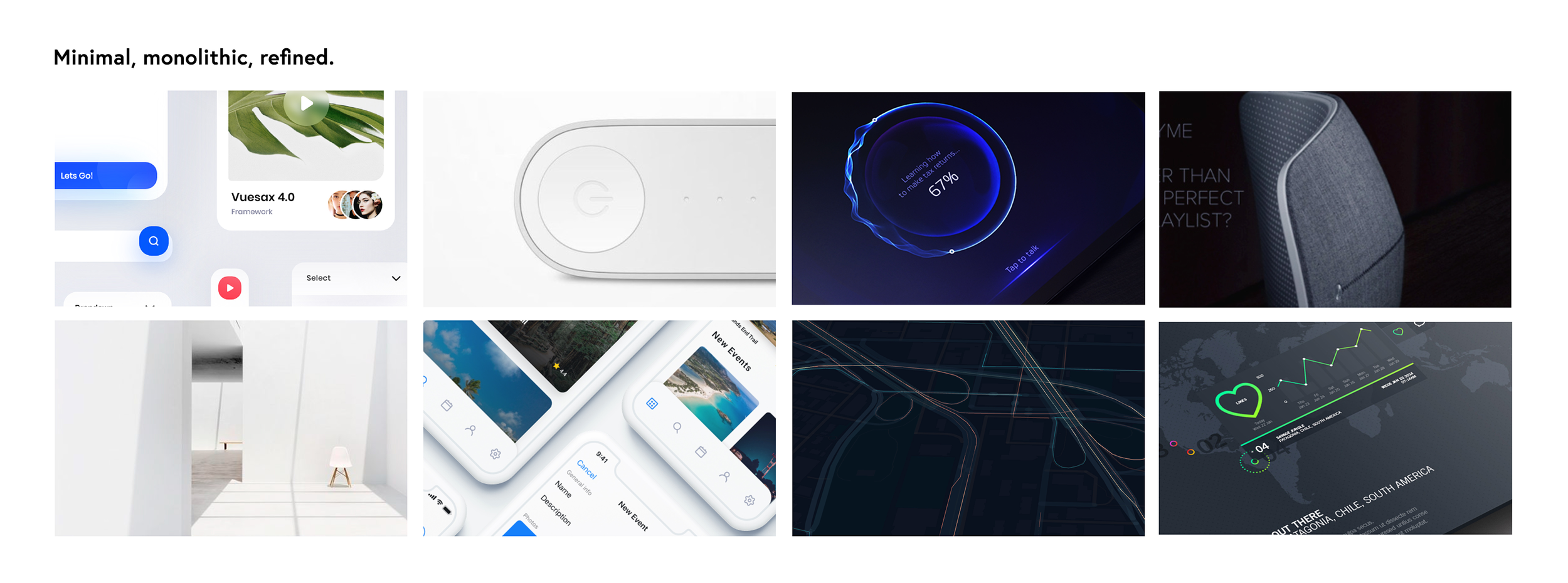
To express “luxury” in digital, I looked for visual references that conveyed minimalism, and chose palettes that are balanced and easy to the eye. I wanted this product to feel universal, rather than “exclusive”.
Another goal was to leverage Material Design components and principles to create a flexible interface; one that is easily adaptable to different devices. And lastly, stay away from the commonly outdated and “heavy” aesthetic of infotainment systems.


High Fidelity Designs


Given the nature of this exercise, time and resources available; the concept is still superficial, and I’m naturally left with many questions and additional ideas. There was so much more to explore and improve; and many areas of the product to tackle (i.e. registration, onboarding, trip scheduling, cabin settings, service offering, and recommendations).
A few aspects I’d like to mention, that would have benefited the concept but were not possible are: in-person interviews and specific user research (i.e. observing the use of existing infotainment systems) for more depth; more time brainstorming - for more creative value; and of course concept validation (test, iterate, test, refine).
Prototype available soon.
